BIOGOTH and Spectrum

BIOGOTH is a surface pattern and design collection celebrating nature’s biodiversity. My focus on color theory draws me to unusual and ‘difficult’ colors and unusual natural pigmentation like…
Iridescence

“Iridescent butterflies” surface pattern product mockup: stationery set.

Fabric sample of Hummingbird Forest surface pattern
Bioluminescence

Blue Ring Octopus surface pattern product mockup: notepad, pencil, journal, and clipboard set.
Translucency

“Baby squid” surface pattern product mockup: stationery set.

Velvet pillow designed with Rainbow Frogs surface pattern

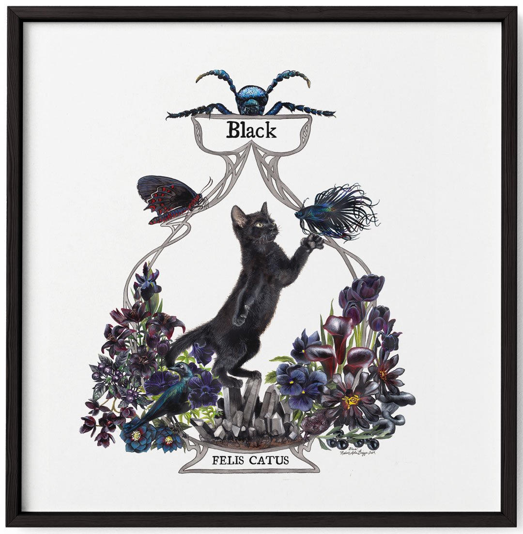
“Onyx” surface pattern product mockup: notepad, pencil, journal, and clipboard set.
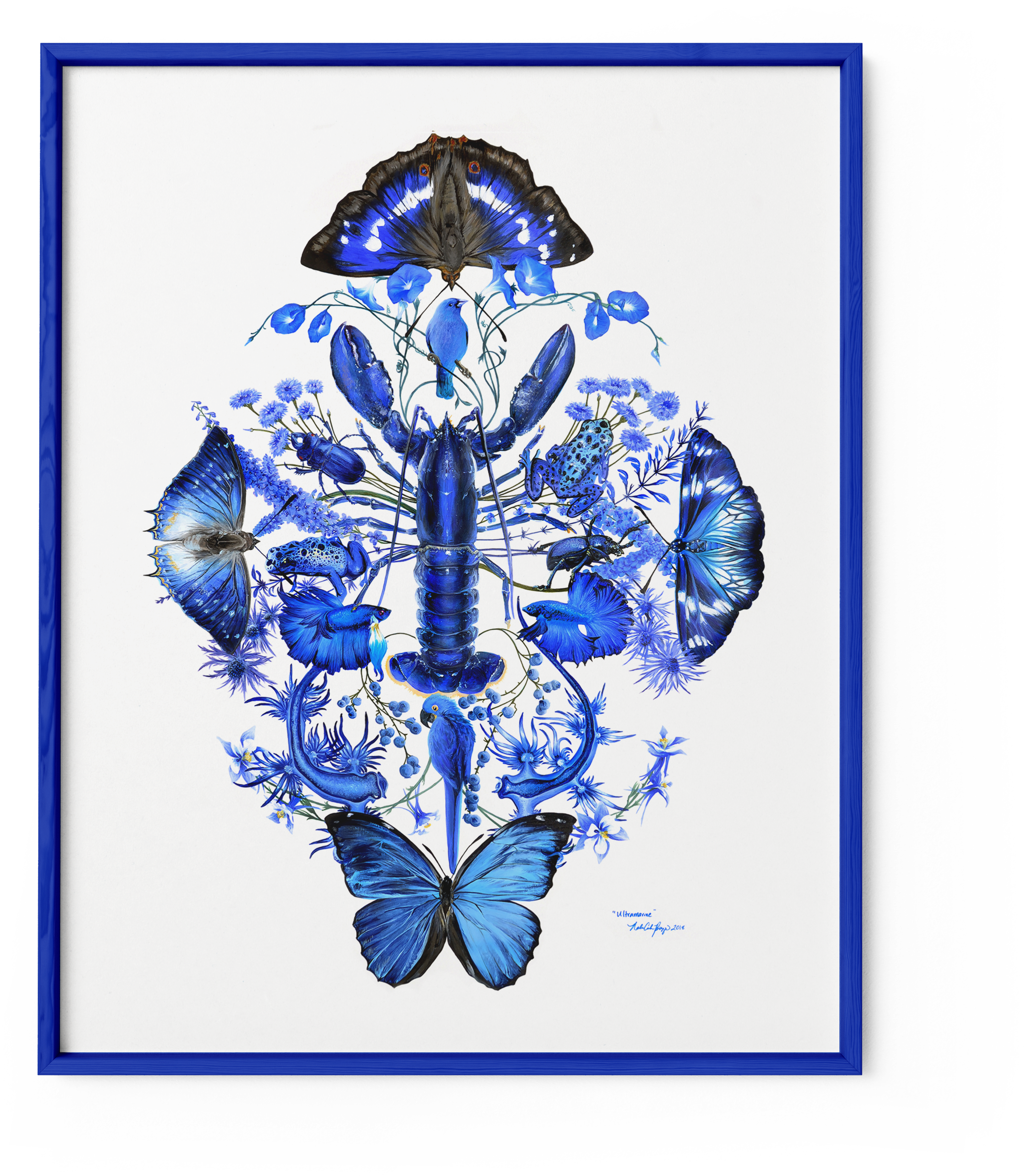
Spectrum
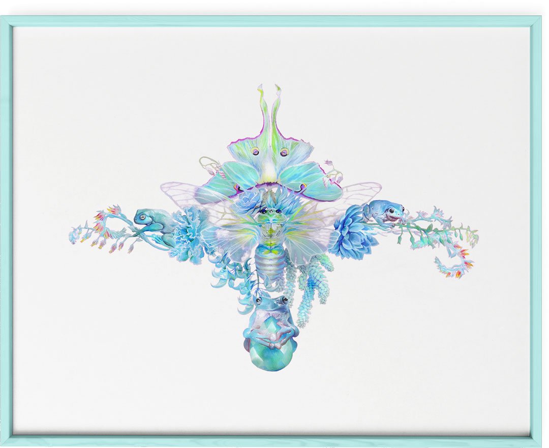
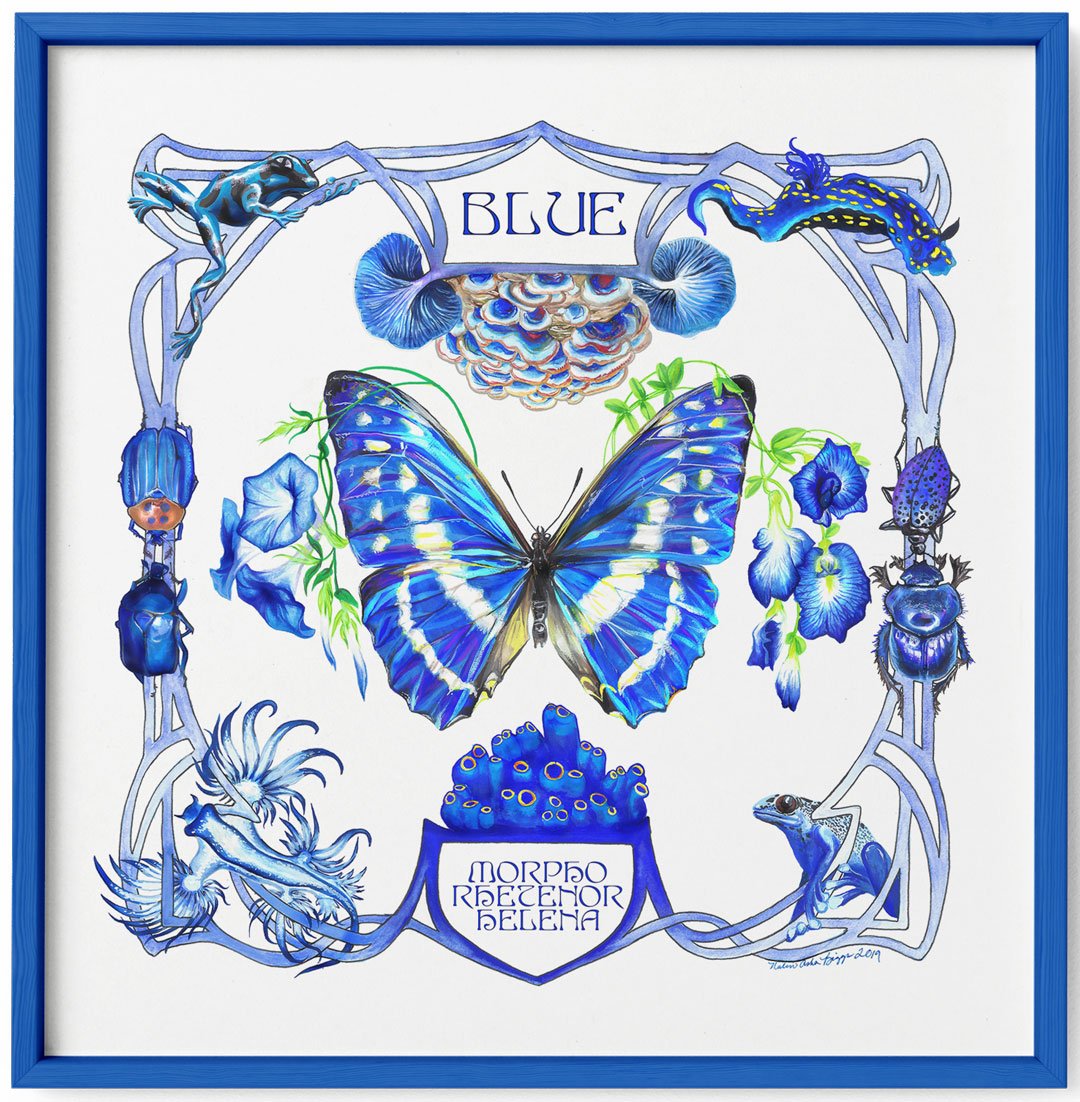
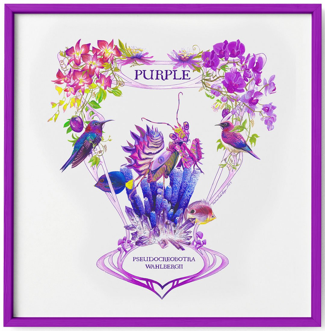
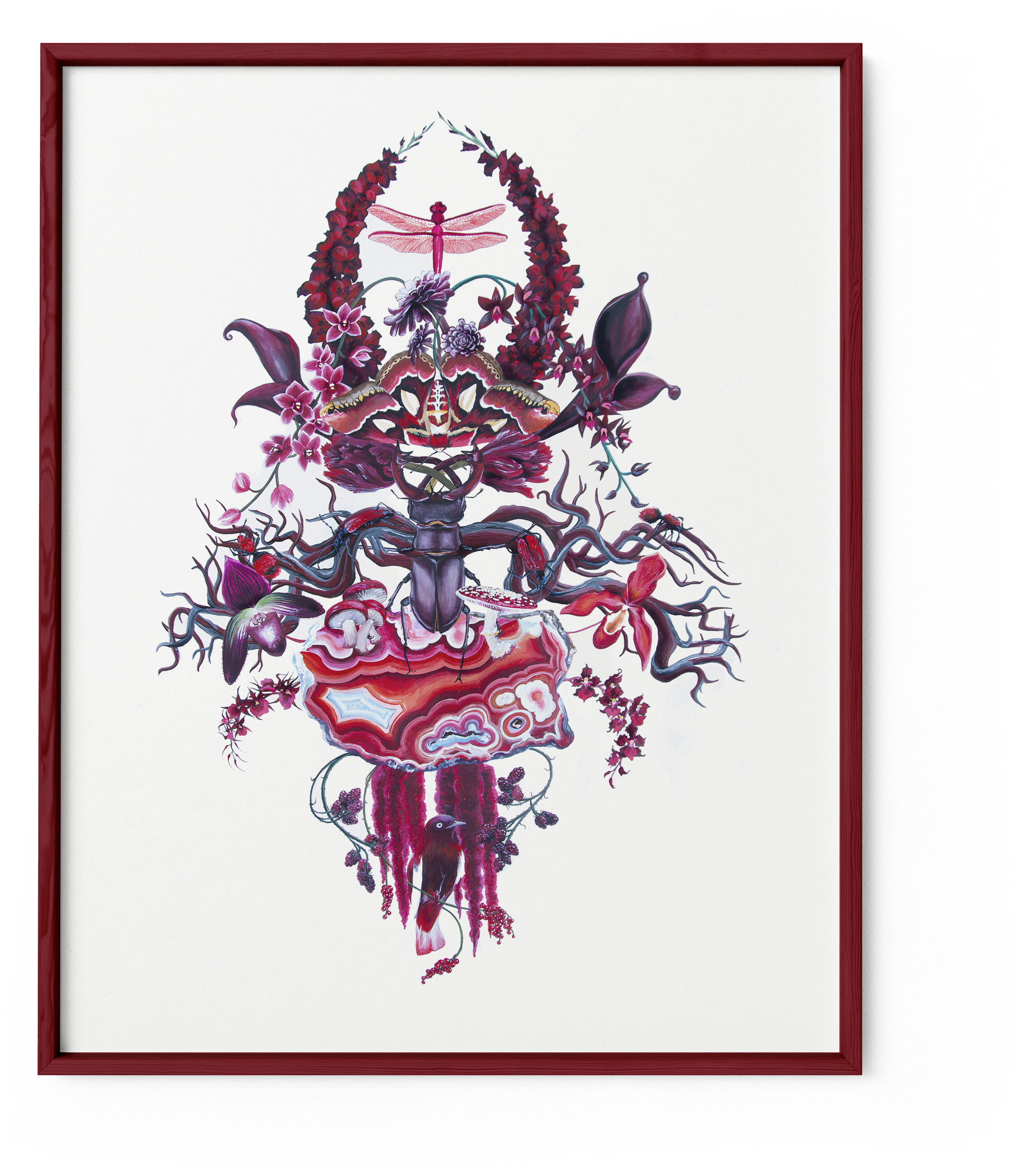
This collection began with a series of color portraits I entitled Spectrum as part of a former Ph.D. dissertation on the Autistic Phenomenology of Color. These meditations on color as performed by nature resulted in floral-like arrangements of animals, plants, minerals, and microorganisms to illustrate a reflection of my own “favorite colors.”
See my full Spectrum collection here.
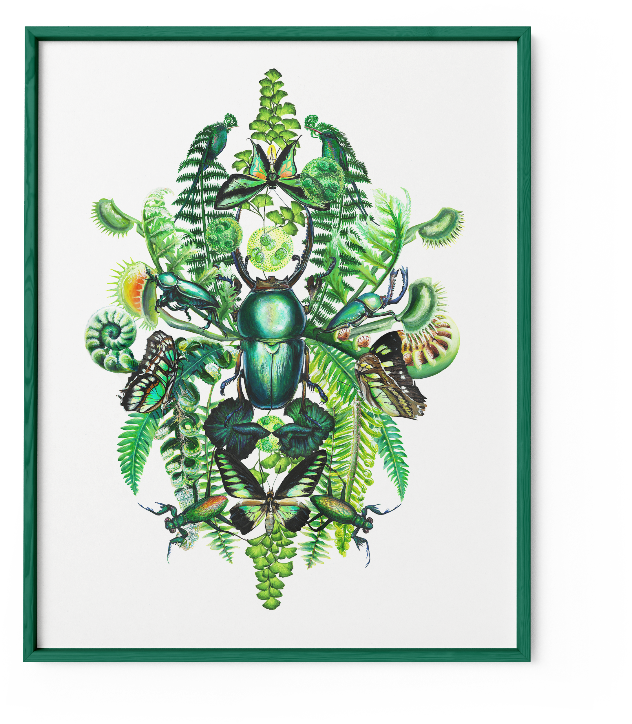
My work evolved towards color combinations and repeating patterns resulting in what I now call my BIOGOTH collection. The Gothic aesthetic gives preference to forms of beauty that are either ignored or rejected by popular opinion. For myself, beauty lies in the unexpected, the “too much,” and the dangerous.
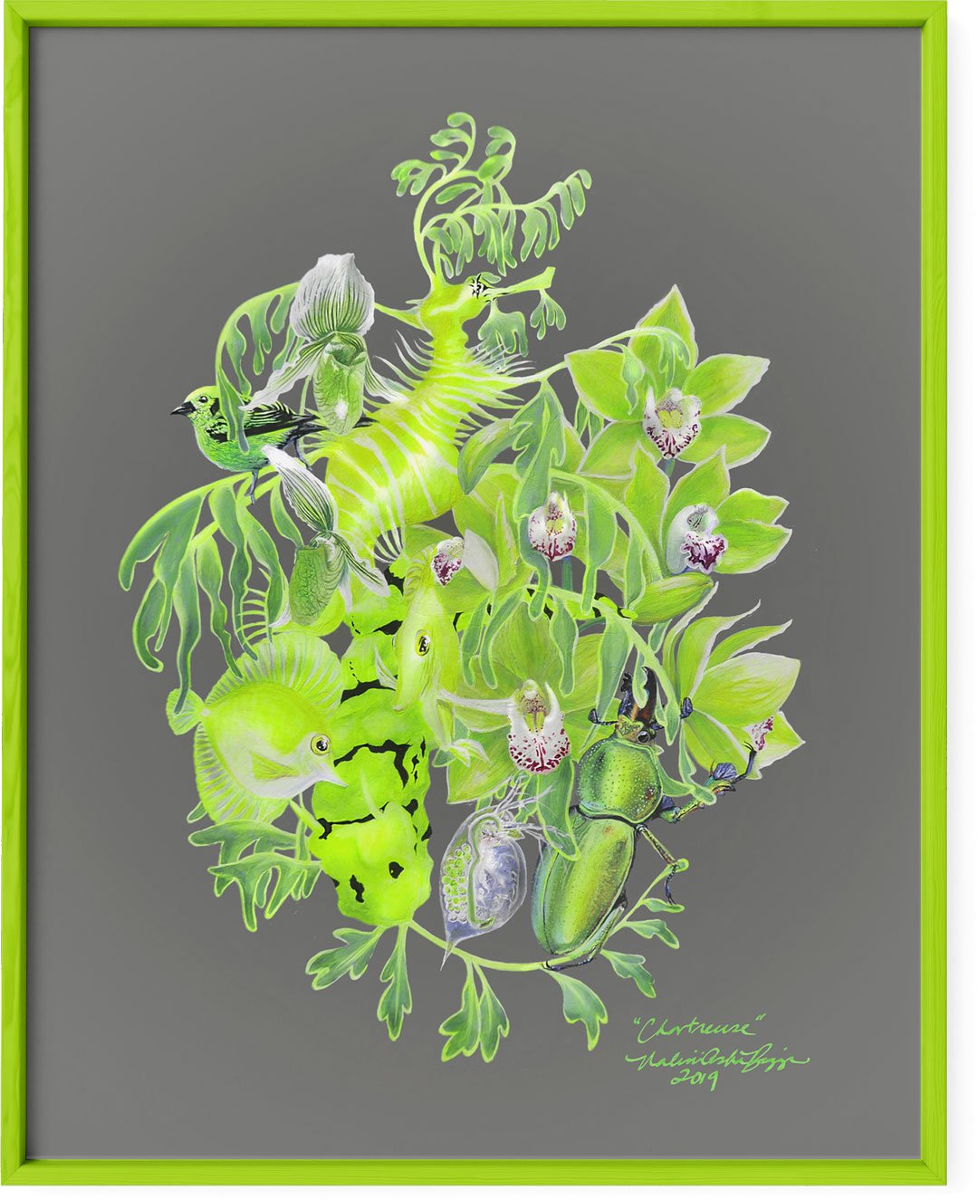
When I’m chasing a color, I go “to the end and back” of how it appears in nature. I disregard scale, placing microscopic algae next to fern leaves and a Giant Green Birdwing butterfly in order to effect that rich, deep, translucent green tone I call “Malachite.”

“Malachite” painting, 2018

“Malachite” surface pattern product mockup: canvas apron.
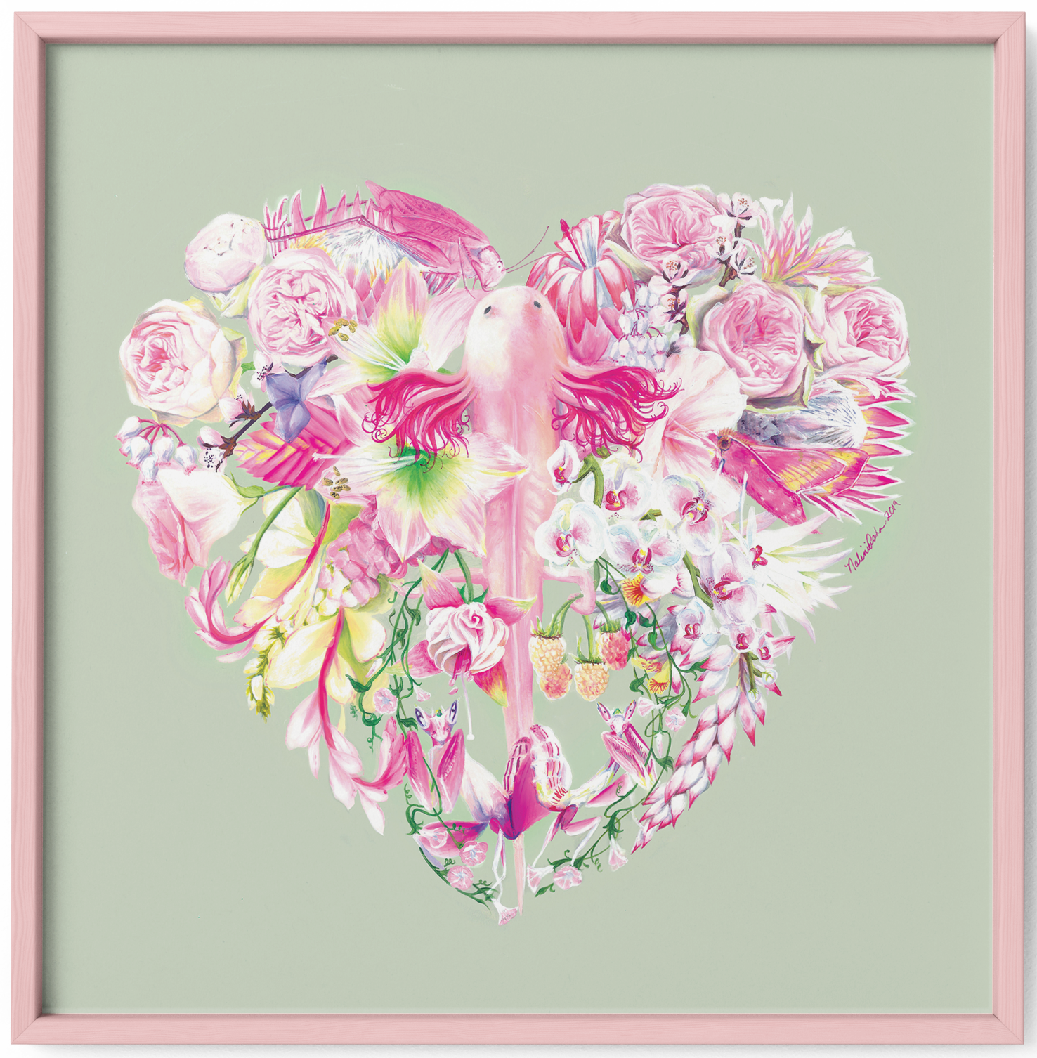
I disregard traditional associations with colors by centering unexpected representations like my “Blushing Axolotl” painting. When I feel the color I call “Blush,” it comes to me as the shades of translucent pale pinks in the skin and gills of the Mexican cave salamander the “Axolotl.” While peonies and roses are stereotypical “pink” flowers, I intentionally mix in bromeliads and pink insects to balance out the frothy with the structured, the velvety with the sharp. All of these tiny iterations and aspects of pale cool pink erupts into an organic incarnation of “Blush.”


“Blushing Axolotl” surface pattern product mockup: velvet pillow.
As a set, this series they offer a treatise of natural color while troubling the idea that there is a "natural" state of color. We experience tones visually, (with a small minority of humans experiencing it through synesthesia or through the blind experience) but this is always constituted through other truths of color: their names, their histories, their uses, their places in our lives.
For me, color is always rooted in a foundation of flora and fauna. Pigments used to color artificially created objects are perpetually in contest with an "original" color produced outside of human contact (except in cases of human-influenced selection).
Color is also dynamic and never static. It cannot be captured as a field, but rather must be compiled as a collage of the different angles, shapes, textures, and materials through which it is animated. One never simple sees a color, but instead sees one specific moment, angle, size, distance, and refraction of a color.
Is it opaque?
Is it glossy?
Does it hold moisture or does it feel chalky?
Colors are always relative to their environment, and to truly understand the idiosyncrasies of a color you need to experience it against not its opposite but its relatives. To specify a burgundy you must compare it to all other similar tones. Is it warmer? Richer and more saturated? Less shiny? More muted?
Placing a color against its opposite creates easily discernible division and jolts the viewer, making it a useful tool for visual media, but for me personally it is often disrespectful of the colors. Think about the commonly cited optical illusion where a red square is placed on a field of green and a field of purple. To most, these squares appear to be different shades, one more orange then the other, when in "fact" they are the same. But they are not. If you see them as different colors, they are in fact different. To place a color against its opposite alters that color, which isn't inherently bad, but it makes it difficult to empathize with the color on it's own terms. Because there are no "neutral" colors, placing it against white or black or gray still alters the color itself. Only positioning a color in tandem with its family allows it to speak its truth more subtly, rather than having to shout.
This is how I experience color, as a kind of empathetic discussion. When I'm pursing a truth of a color, I do everything in my power to provide it the environment that allows it to speak for itself and make itself known to me on its own terms. In this sense I actively socialize with color in my everyday life. I relate to colors in a similar way that most people relate to other humans, sometimes animals. I have close friends for life, acquaintances that occasionally become temporarily important, I have exes and crushes and I frequently fall in love.
And this series, Spectrum, is in fact a love story in the form of a series of portraits of color.

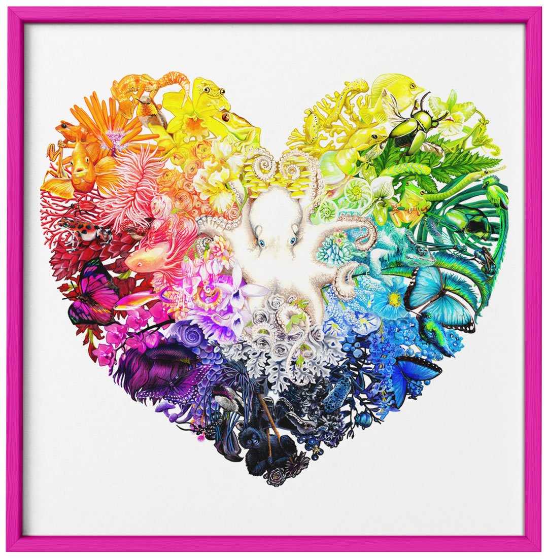
Nalini Asha Biggs, “Rainbow” (2019), gouache and acrylic on paper.
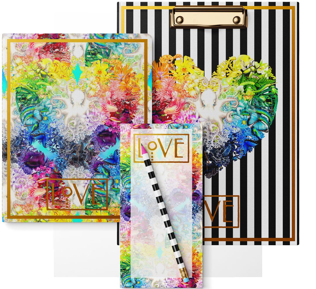
Rainbow surface pattern product mockup: notepad, pencil, journal, and clipboard set.
The final piece in my Spectrum collection entitled “Rainbow” is an explosion of the full spectrum of visible color as illustrated through plants and animals centered around a white, camouflaging octopus. “Rainbow” makes explicit what my other Spectrum paintings show implicitly: Nature is non-binary, never black and white but always a full spectrum of every color and shade and texture imaginable.
Check out my Biogoth digital downloads for sale on Etsy!


CONTACT ME if you are interested in licensing any my current BIOGOTH designs, or commissioning me for custom, original work.